WEBSITE DESIGN
...and why it matters
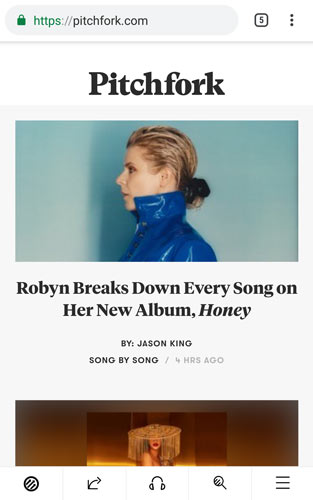
THE GOOD...

- Responsively designed; site takes a mobile-first/thumb design making navigation easy on mobile devices.
- Balanced use of white space.
- Sticky header at top of large viewport makes navigation easier as links are always within view.
- High contrast makes site easier to read.
- Well organized; content broken into blocks.
- Good use of consistency - the use of the color red is repeated across the site to indicate hover and
selection of linked content.
fullscreen | mobile
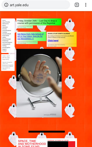
THE BAD...

- No consistency across site - different animated GIFs used on each page which distracts from content.
- Small text is hard to read.
- Too much white space on right side and not enough around areas of content.
- Site lacks organization; content itself is confusing, not quickly identifiable and lacks flow.
- Some font colors are not legible against background colors.
- Static contact information at top of page uses same font color as social media links at the bottom
of page. This causes confusion in identifying links.
- No responsive web design. Site is difficult to navigate on a mobile device.
fullscreen | mobile
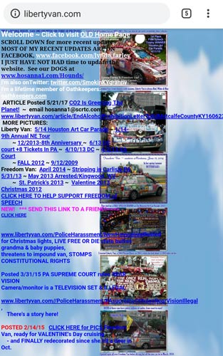
THE UGLY...

- No formatting or consistency with fonts makes reading difficult.
- While links are underlined they are the same color as neighboring text.
- Cluttered content on left and empty space on right of page.
- Text, links and images feel chaotic and hard to understand.
- No responsive web design. Site is impossible to navigate on a mobile device as text overlaps images.
fullscreen | mobile


